jrmbadger
Well-Known Member
- Thread starter
- #1
There. I said it.
With all the negative posts these days about software and the Rivian, I thought I would post a positive experience. My family owns both a gen 1 R1S and a tesla model y. Over the past 6 months, I have really come to appreciate the well-thought out layout of the Rivian in-car UI.
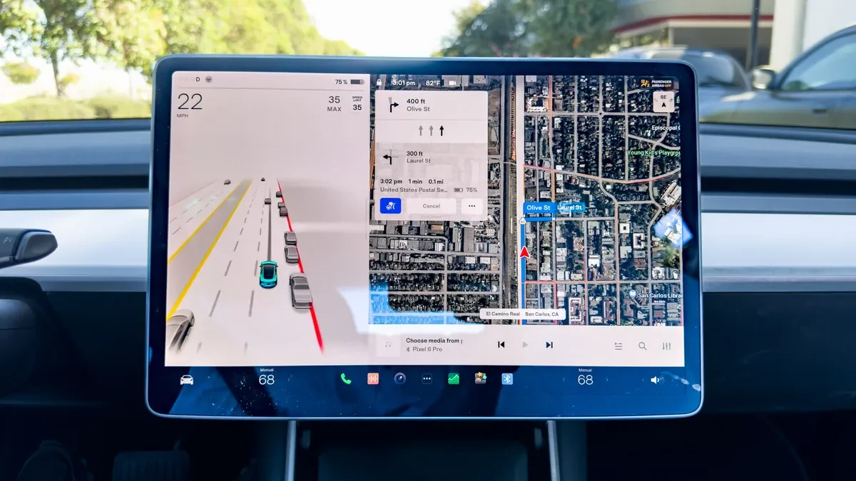
While Tesla rightly receives praise for its software, like a lot of things Tesla, it needs a refresh. Over time, the model y's interface has become cluttered. They are simply trying to hard to fit too much on the center screen. While the main driving screen is ok, it still needs to fit EVERYTHING in this one screen. The regen, the speed, the drive mode, the battery percentage, the driver assist stuff, the nav stuff, the media stuff:

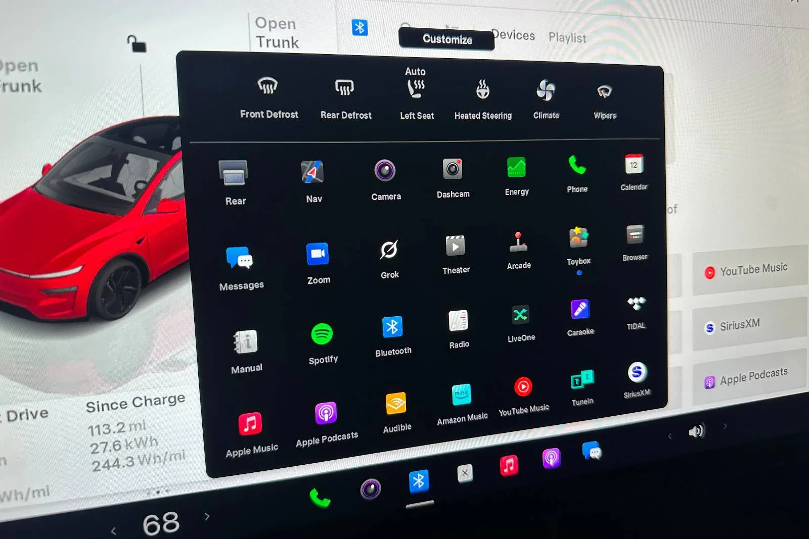
The main screen is somewhat cluttered but the "apps" screen is a cluttered mess. While I realize there is a "customize" button, I shouldn't have to spend a lot of time trying to reorganize apps, especially when I rarely use half of them anyway. There is no inherent organization here either. It's just literally a mess of apps thrown together.

It took me WAY too long to find the radio the last time I wanted to switch music sources.
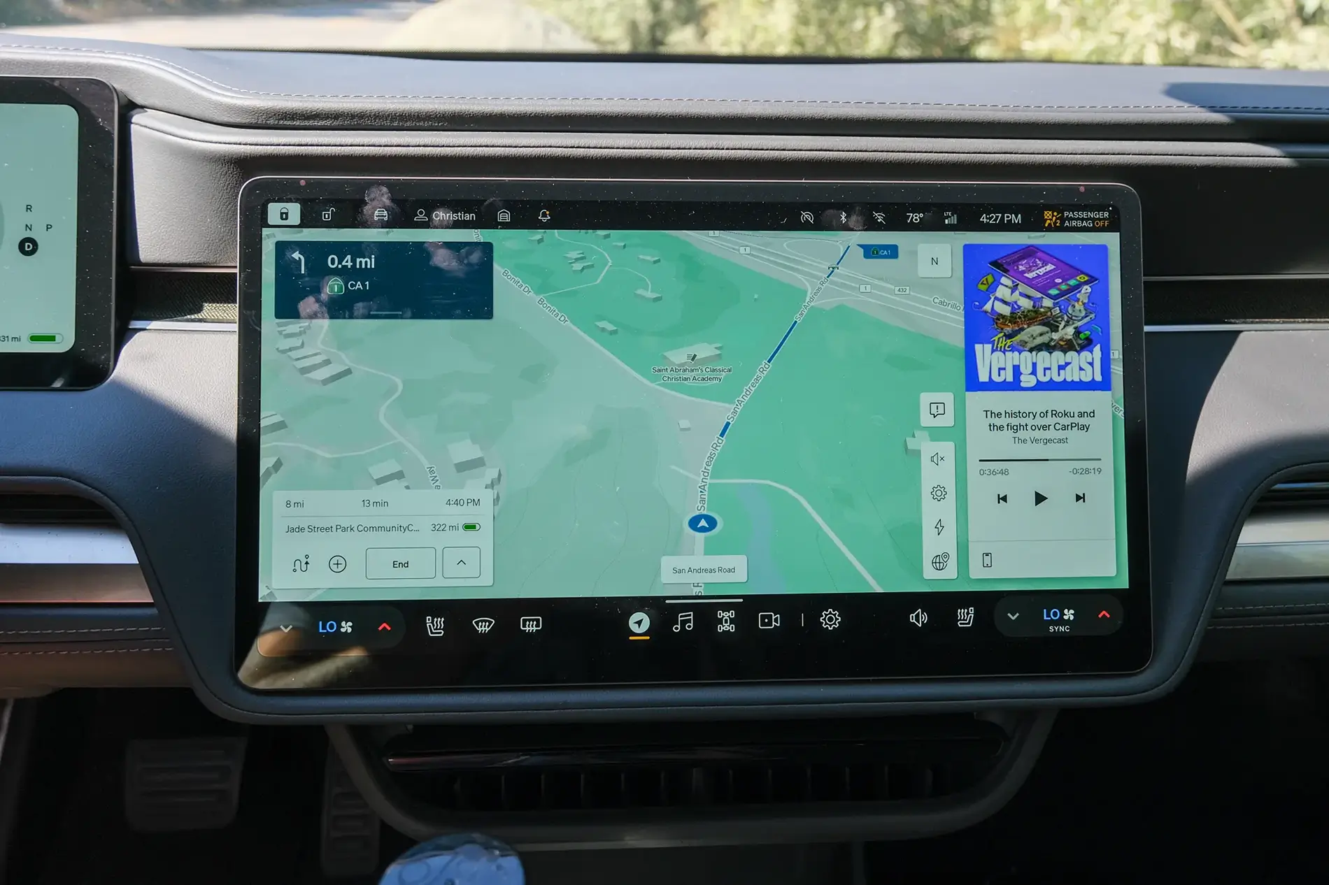
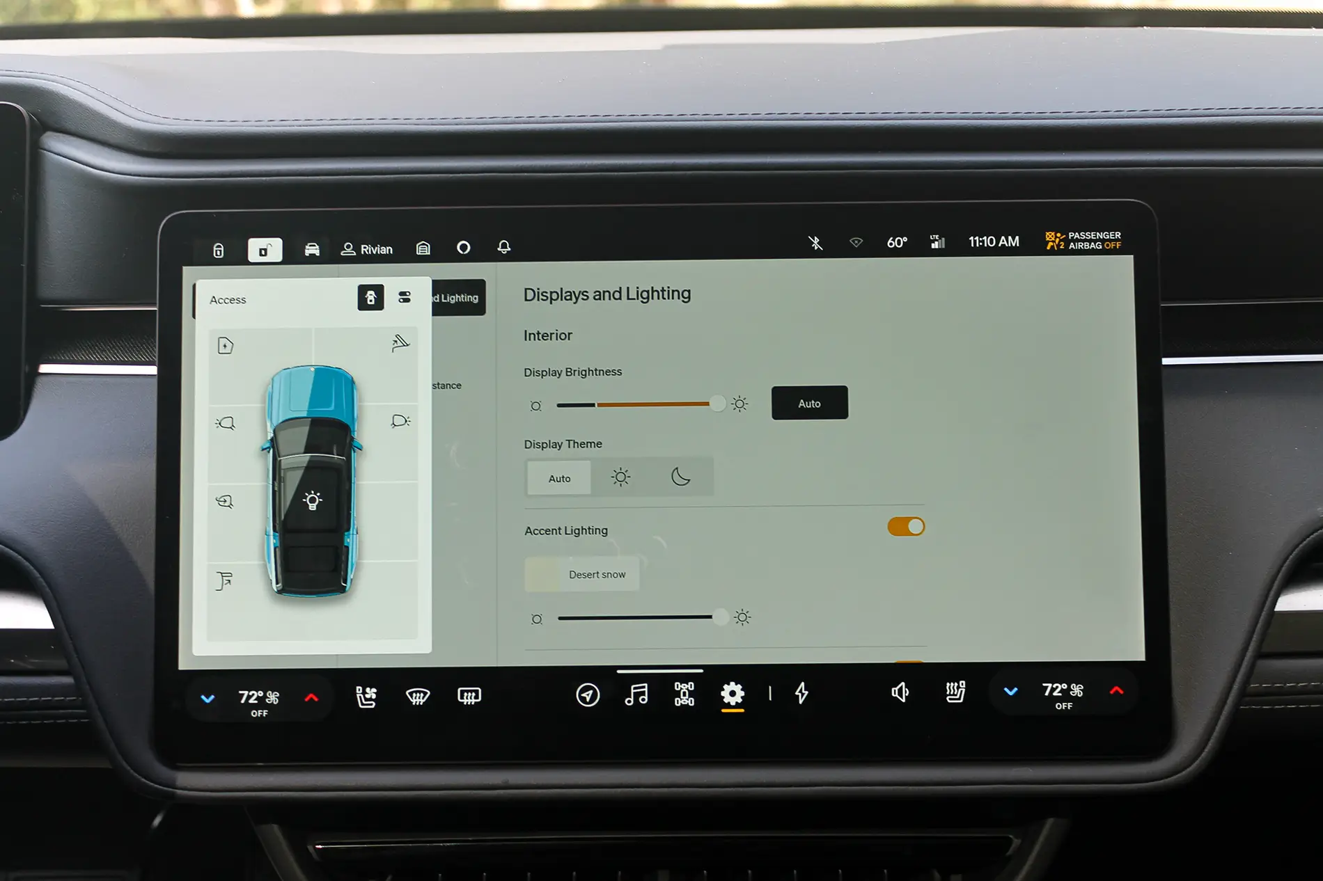
The Rivian UI is much cleaner and better organized. Obviously part of this is having two screens so the Rivian doesn't have to cram the driver's assist and speedo onto the main screen:

I will say too, that the top and bottom black bars having the information and quick access stuff looks cleaner.
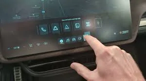
The apps button shows a much cleaner organization (sorry for the low quality - it was the only pic I could find):

Notice how the apps are categorized? Phone, GearGuard, Camping, Manual, etc...
I will give Tesla credit for the car control screen - when the car is parked it shows a picture of the car and you just press on the frunk, trunk, etc... to open that control. Rivian's however, is not quite as convenient, as you have to select it, but it is better in that it's easier to change mirrors, steering wheel, etc... much easier.
With Tesla you have to navigate to the car settings, click controls (if it isn't already up), and then touch mirrors.
I will say, I do hate the way Rivian makes you turn on your seat heaters to cool them, or turn down your seat heaters just to turn on your steering wheel heater - that needs to be fixed.
Now, the Tesla mobile app is WAY better than the Rivian and works 90% of the time the first time, unlike the Rivian's, which, for me, works about 20% of the time the first time.
This is just my opinion.

With all the negative posts these days about software and the Rivian, I thought I would post a positive experience. My family owns both a gen 1 R1S and a tesla model y. Over the past 6 months, I have really come to appreciate the well-thought out layout of the Rivian in-car UI.
While Tesla rightly receives praise for its software, like a lot of things Tesla, it needs a refresh. Over time, the model y's interface has become cluttered. They are simply trying to hard to fit too much on the center screen. While the main driving screen is ok, it still needs to fit EVERYTHING in this one screen. The regen, the speed, the drive mode, the battery percentage, the driver assist stuff, the nav stuff, the media stuff:
The main screen is somewhat cluttered but the "apps" screen is a cluttered mess. While I realize there is a "customize" button, I shouldn't have to spend a lot of time trying to reorganize apps, especially when I rarely use half of them anyway. There is no inherent organization here either. It's just literally a mess of apps thrown together.
It took me WAY too long to find the radio the last time I wanted to switch music sources.
The Rivian UI is much cleaner and better organized. Obviously part of this is having two screens so the Rivian doesn't have to cram the driver's assist and speedo onto the main screen:
I will say too, that the top and bottom black bars having the information and quick access stuff looks cleaner.
The apps button shows a much cleaner organization (sorry for the low quality - it was the only pic I could find):
Notice how the apps are categorized? Phone, GearGuard, Camping, Manual, etc...
I will give Tesla credit for the car control screen - when the car is parked it shows a picture of the car and you just press on the frunk, trunk, etc... to open that control. Rivian's however, is not quite as convenient, as you have to select it, but it is better in that it's easier to change mirrors, steering wheel, etc... much easier.
With Tesla you have to navigate to the car settings, click controls (if it isn't already up), and then touch mirrors.
I will say, I do hate the way Rivian makes you turn on your seat heaters to cool them, or turn down your seat heaters just to turn on your steering wheel heater - that needs to be fixed.
Now, the Tesla mobile app is WAY better than the Rivian and works 90% of the time the first time, unlike the Rivian's, which, for me, works about 20% of the time the first time.
This is just my opinion.

Sponsored

