Sponsored
Supratachophobia
Well-Known Member
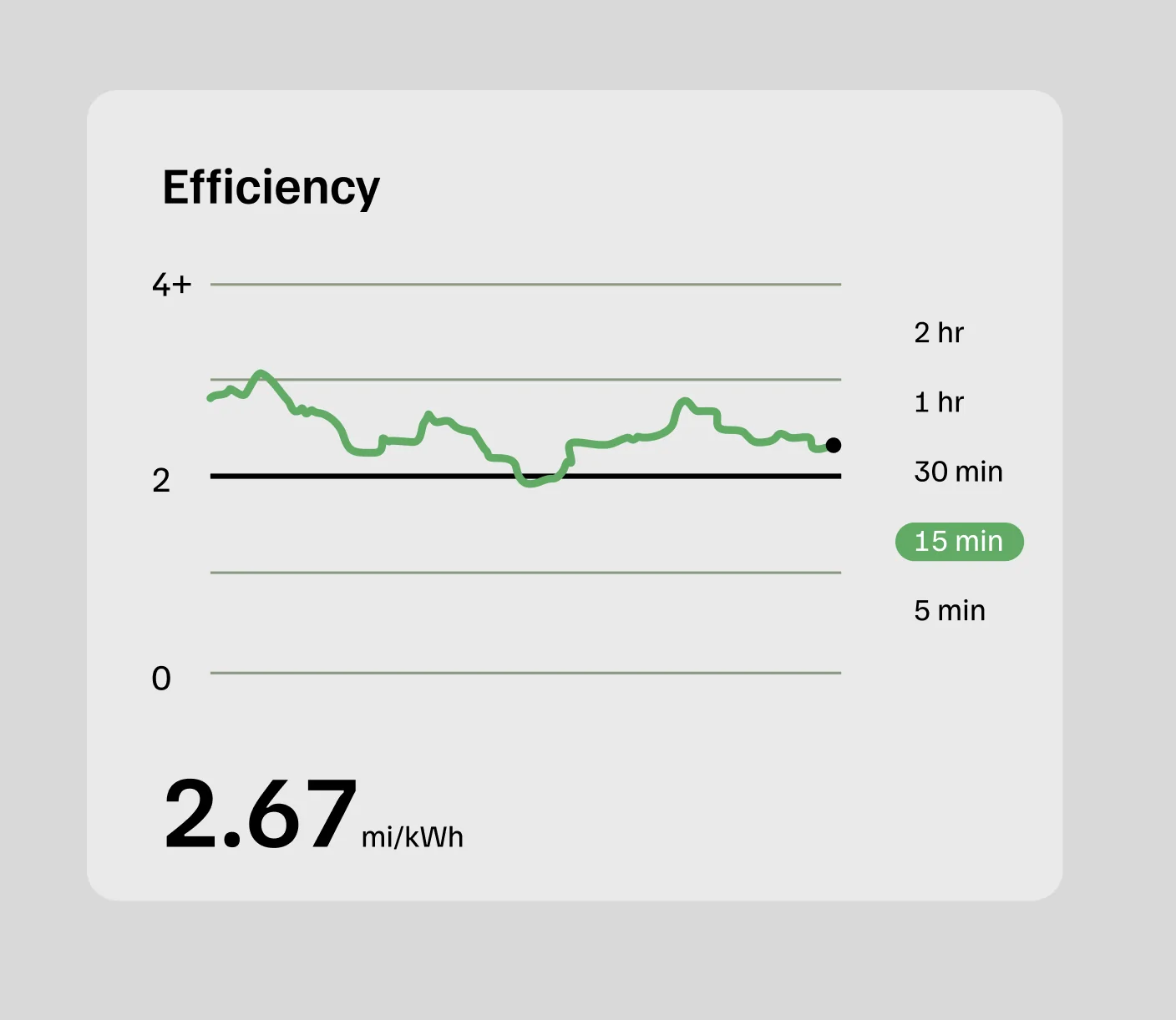
Any option to scale out like Tesla? 5 min, 15 min, current trip sessionQuestions:
- why is the bar graph so big?
- why is the bar graph that indicates a slower trend fatter and more prominent that the instantaneous power graph?
- if white dot equals good efficiency and black dot means bad efficiency, what does black dot on the power graph mean?
- why neon?
- how many colors of green does one need on one screen?
- why the thick magic marker lines?
- why does “last 15m” have a font that indicates it’s equally as important as my range and battery?
Hideous and distracting.
BCondrey
Well-Known Member
- First Name
- Barry
- Joined
- Dec 12, 2021
- Threads
- 0
- Messages
- 694
- Reaction score
- 695
- Location
- Richmond, VA
- Vehicles
- R1T
- Occupation
- IT
I like it, but I think there is room for improvement. It tells me what I need to know and it is easier to see than the last one. Rivian iterates on stuff like this. Keep it up Rivian.
dgennetten
Well-Known Member
- First Name
- Douglas
- Joined
- May 4, 2023
- Threads
- 11
- Messages
- 151
- Reaction score
- 204
- Location
- Fort Collins
- Vehicles
- R1S
- Occupation
- Retired Electrical Engineer
I have long opined that it should be over distance, not time. Would love to hear an explanation from them.
It seems to be somewhat let dampened, which I like.
It seems to be somewhat let dampened, which I like.
Sponsored
SeaGeo
Well-Known Member
Pretty sure it's the average efficiency over the last 15 minutes. The graph seems to show a 15 minute history of that.What does the vertical bar to the right show?
usulio
Well-Known Member
I wouldn't be surprised if you're right, but for example, averaging the height of the graph would not be the correct answer for your mi/kWh efficiency over the distance traveled in the last 15 minutes.Pretty sure it's the average efficiency over the last 15 minutes. The graph seems to show a 15 minute history of that.
Kunzene
Well-Known Member
It’s not. It’s basically the most recent value on the graph. Imagine that dot is drawing the line graph. So it’s both redundant and useless. The previous bar that showed impact on range was much more useful.Pretty sure it's the average efficiency over the last 15 minutes. The graph seems to show a 15 minute history of that.
DTM
Member
- First Name
- Dennis
- Joined
- Aug 2, 2020
- Threads
- 0
- Messages
- 20
- Reaction score
- 6
- Location
- San Miguel, CA
- Vehicles
- '17Bolt, '14 Porsche Cayenne, '04 Dodge {Cummins}
- Occupation
- Retired.
I like the new display. It is easier to see what's happening "real time". I know I won't ever get the "rated" mileage because I've never gotten more tha 2.4 Mi/kW on the highway (I rarely drive over 70). Based on the battery size & what I'm getting, rated mileage will never happen. (I chose not to drive my R1T to Alaska in May because of charging availability. I drove our Diesel Cayenne instead.) I learned from our 2017 Bolt that it's a "guess-O-Meter". I'm just happy not buying diesel for my truck anymore!
Sponsored
boosted20v
Well-Known Member
- First Name
- Brian
- Joined
- Jun 28, 2024
- Threads
- 11
- Messages
- 177
- Reaction score
- 179
- Location
- Manvel, TX.
- Vehicles
- R1T Adventure QM
- Occupation
- Finance
This is a great idea!!!Here, I fixed it.

OP
OP
elektrode
Well-Known Member
- Thread starter
- #27
Yup. I watched it today and that’s what I determined too. It shows something that it’s already showing. And it’s thick neon.
LOL, I haven’t been this perturbed since they moved the trip meters to the settings page!
It’s not. It’s basically the most recent value on the graph. Imagine that dot is drawing the line graph. So it’s both redundant and useless. The previous bar that showed impact on range was much more useful.
Totally agree. How does something like this make it through review?So it’s both redundant and useless.
LOL, I haven’t been this perturbed since they moved the trip meters to the settings page!
CharonPDX
Well-Known Member
Eeeehhhh…. Quad-Large with the off-road package's rated range is based on 2mi/kWh. So for my vehicle, it's an accurate "middle-point". But I absolutely agree that it should vary based on the configuration of the vehicle. A refresh Dual Standard on range tires should have 3 mi/kWh as its baseline.It's confusing because it's misleading. The baseline 2 mi/kwh is well below what you need to get your vehicle's rated range, but since it's artificially low, it makes you think you're on track to make your truck's rated range if you stay above it.
beatle
Well-Known Member
- Joined
- Jun 20, 2024
- Threads
- 17
- Messages
- 1,144
- Reaction score
- 1,561
- Location
- Springfield, VA
- Vehicles
- '23 R1T PDM Max, '97/'25 Miatas, '19 Monkey
- Occupation
- IT
That's a great point. I thought it was green whenever the average was over 2 mi/kwh, but this is even worse and has zero purpose now. The fact that they took away the tiny honest efficiency bar to show this is pretty insulting. "Hey, honey, look we're all green, we must be making the rated range!"This thing is useless. The dot always matches the most recent plot on the 15-min timeline. Pointless.

SeaGeo
Well-Known Member
Yeah, it's an absurd plot IMO, but I also didn't make it.I wouldn't be surprised if you're right, but for example, averaging the height of the graph would not be the correct answer for your mi/kWh efficiency over the distance traveled in the last 15 minutes.
And to rephrase what I was saying, the value on the far left of the graph would be the 15 minute average value 15 minutes ago. The value on the far right would be the 15 minute average at that moment. Hence the slow linear decrease if you just sit still in traffic.
Yeah, the most recent value on the graph is, as far I I can tell, a 15 minute average.It’s not. It’s basically the most recent value on the graph. Imagine that dot is drawing the line graph. So it’s both redundant and useless. The previous bar that showed impact on range was much more useful.
I agree that it's redundant.
Sponsored
Similar threads
- Replies
- 35
- Views
- 2,511
- Replies
- 5
- Views
- 744
- Replies
- 14
- Views
- 1,711