Sponsored

Rivian's in-car UI is better than Tesla's

tmbm50

Well-Known Member
Joined
Dec 31, 2025
Threads
3
Messages
67
Reaction score
108
Location
USA
Vehicles
2026 R1T Quad
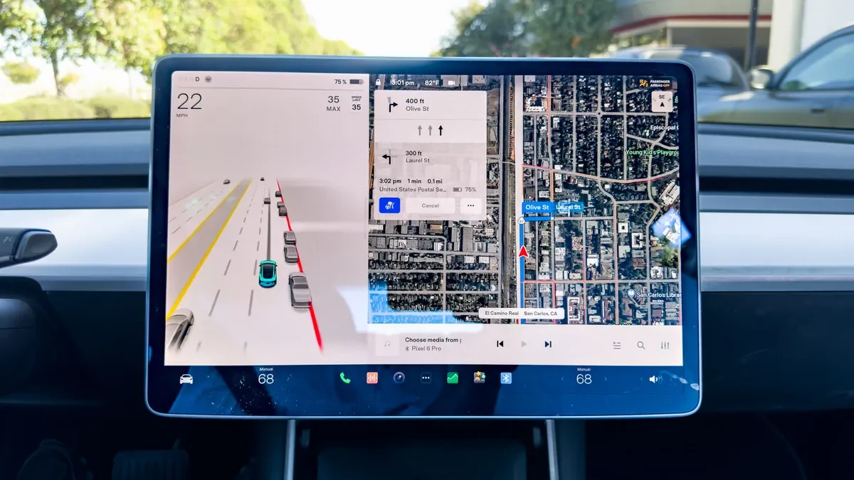
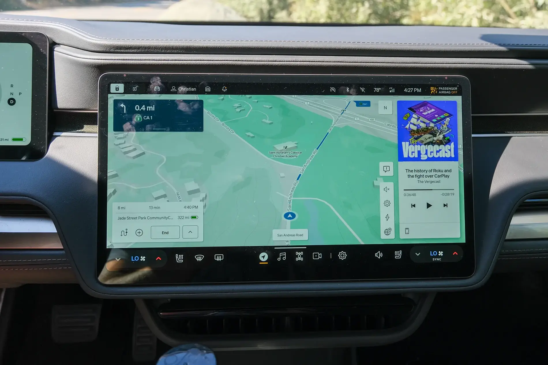
As a new 2026 R1T owner coming from years in a Model X (which has driver and central screens), I so far appreciate the Rivian interface. Its more open feeling and apps like Tidal are better. Google maps searching and adding stops is soooo much better than on my X.

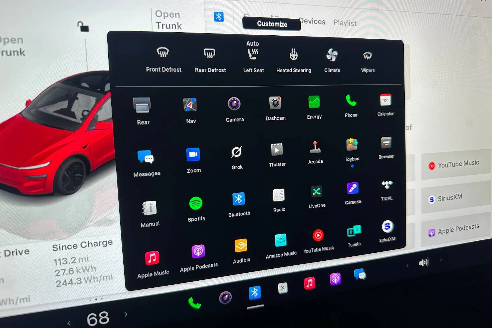
Tho alot of that could just be the rivian does less. It might not scale as they add features and it gets Tesla level cluttered.

But for now, I'm enjoying it while it last.
Sponsored


HaveBlue

Well-Known Member
Joined
Nov 22, 2022
Threads
41
Messages
2,926
Reaction score
2,234
Location
91107
Vehicles
R1S DMP Max, Lifted GX470, APR Audi A7, BMW 325Ci
Clubs
 
The rivian UI is pretty well sorted at this point. The important controls still have proper levers and buttons so you don't have to take your eyes off the road.

Where it drastically lacks is the service screen compared to how many things the Tesla one can do. I guess it doesn't matter since we can't buy parts to fix things anyway.
 

skyguyscott

Well-Known Member
First Name
Scott
Joined
Jul 29, 2025
Threads
11
Messages
337
Reaction score
553
Location
whereverIroam
Vehicles
2026 R1T
The rivian UI is pretty well sorted at this point. The important controls still have proper levers and buttons so you don't have to take your eyes off the road.
As studies and accident investigations have shown, and as I have now come to agree from my own driving experience, physical controls do indeed beat screen controls for certain functions in both ease of use, and critically, attention time demanded of the driver to activate or change functions.

I think that within a few years, car makers will eventually add back physical knobs and buttons, either on the dash or steering wheel (or maybe those crazy "pods" from certain '80s GM vehicles) simply because they are safer -- unless they go full automated chauffeur/valet AI or on-board voice activation. My guess is that while screen controls are cheaper to build, buttons beat AI self driving costs, and certainly beat liability exposure for the car makers.

Not every function has to have a physical button, of course, but the most often used like media source and volume, door locks, HVAC controls (including the vent positions) probably should be able to be controlled without the driver having to take their eyes off the road.

I think Rivian wisely kept many of the stalk controls intact, and I will bet the R2 may and the R3 almost certainly will have physically positioned air vents instead of screen driven step motors.

Now, if Rivian really wanted to go back to the future, they could always field some of these experiemental alternatives to the steering wheel. My fav, Mercedes' F200 joystick, which pretty much mimicked how the Lunar Rover worked.
 
Last edited:

BCondrey

Well-Known Member
First Name
Barry
Joined
Dec 12, 2021
Threads
0
Messages
692
Reaction score
692
Location
Richmond, VA
Vehicles
R1T
Occupation
IT
We own a 2025 (wife) Tesla M3 and a R1T (me). The tesla uses a lot of swiping gestures and I can never find anything when I need it. The R1T categorizes functions, and has the quick access buttons at the bottom of the screen. It is much cleaner in my opinion. I guess I could get used to the Tesla given enough time, but I would still prefer the Rivian.
 

iowa_don

Well-Known Member
First Name
Don
Joined
Mar 31, 2025
Threads
2
Messages
76
Reaction score
38
Location
Arizona
Vehicles
R1S Gen 2
Occupation
Retired
There. I said it.

With all the negative posts these days about software and the Rivian, I thought I would post a positive experience. My family owns both a gen 1 R1S and a tesla model y. Over the past 6 months, I have really come to appreciate the well-thought out layout of the Rivian in-car UI.

While Tesla rightly receives praise for its software, like a lot of things Tesla, it needs a refresh. Over time, the model y's interface has become cluttered. They are simply trying to hard to fit too much on the center screen. While the main driving screen is ok, it still needs to fit EVERYTHING in this one screen. The regen, the speed, the drive mode, the battery percentage, the driver assist stuff, the nav stuff, the media stuff:

1767375930323-p2.webp


The main screen is somewhat cluttered but the "apps" screen is a cluttered mess. While I realize there is a "customize" button, I shouldn't have to spend a lot of time trying to reorganize apps, especially when I rarely use half of them anyway. There is no inherent organization here either. It's just literally a mess of apps thrown together.

1767374720293-gm.webp


It took me WAY too long to find the radio the last time I wanted to switch music sources.

The Rivian UI is much cleaner and better organized. Obviously part of this is having two screens so the Rivian doesn't have to cram the driver's assist and speedo onto the main screen:
1767375174762-mu.webp


I will say too, that the top and bottom black bars having the information and quick access stuff looks cleaner.

The apps button shows a much cleaner organization (sorry for the low quality - it was the only pic I could find):
1767375246949-tv.webp

Notice how the apps are categorized? Phone, GearGuard, Camping, Manual, etc...

I will give Tesla credit for the car control screen - when the car is parked it shows a picture of the car and you just press on the frunk, trunk, etc... to open that control. Rivian's however, is not quite as convenient, as you have to select it, but it is better in that it's easier to change mirrors, steering wheel, etc... much easier.
1767375510240-bp.webp


With Tesla you have to navigate to the car settings, click controls (if it isn't already up), and then touch mirrors.

I will say, I do hate the way Rivian makes you turn on your seat heaters to cool them, or turn down your seat heaters just to turn on your steering wheel heater - that needs to be fixed.

Now, the Tesla mobile app is WAY better than the Rivian and works 90% of the time the first time, unlike the Rivian's, which, for me, works about 20% of the time the first time.

This is just my opinion.

1767376194197-vw.webp
Sorry, I still miss the layout, functionality and responsiveness of my Model S as compared to my R1S. Not to mention that everything they promised actually does work.
 

Sponsored

denverag03

Member
Joined
Nov 19, 2024
Threads
3
Messages
20
Reaction score
18
Location
Denver, CO
Vehicles
2025 R1S
Between my 5 year old MY and year old R1S, the glitches on the R1S drag down the better organization for me. Like the other poster I can’t remember the last time I had to reset the Y. The R1S is like my Windows PC from the 90s. Always bugs and restarts.
 

cjust2006

Well-Known Member
Joined
May 9, 2022
Threads
27
Messages
326
Reaction score
415
Location
Houston, TX
Vehicles
R1T Adv Limestone
Occupation
IT Analyst
Having a clean UI is easy when you don't have nearly as many features. I just rented a Tesla, and while there's a lot going on, you only need to find most of that stuff once in a while.
 

Glenside

Member
First Name
Geo
Joined
Mar 22, 2025
Threads
1
Messages
14
Reaction score
9
Location
E. PA
Vehicles
R1S 2025
There. I said it.

With all the negative posts these days about software and the Rivian, I thought I would post a positive experience. My family owns both a gen 1 R1S and a tesla model y. Over the past 6 months, I have really come to appreciate the well-thought out layout of the Rivian in-car UI.

While Tesla rightly receives praise for its software, like a lot of things Tesla, it needs a refresh. Over time, the model y's interface has become cluttered. They are simply trying to hard to fit too much on the center screen. While the main driving screen is ok, it still needs to fit EVERYTHING in this one screen. The regen, the speed, the drive mode, the battery percentage, the driver assist stuff, the nav stuff, the media stuff:

1767375930323-p2.webp


The main screen is somewhat cluttered but the "apps" screen is a cluttered mess. While I realize there is a "customize" button, I shouldn't have to spend a lot of time trying to reorganize apps, especially when I rarely use half of them anyway. There is no inherent organization here either. It's just literally a mess of apps thrown together.

1767374720293-gm.webp


It took me WAY too long to find the radio the last time I wanted to switch music sources.

The Rivian UI is much cleaner and better organized. Obviously part of this is having two screens so the Rivian doesn't have to cram the driver's assist and speedo onto the main screen:
1767375174762-mu.webp


I will say too, that the top and bottom black bars having the information and quick access stuff looks cleaner.

The apps button shows a much cleaner organization (sorry for the low quality - it was the only pic I could find):
1767375246949-tv.webp

Notice how the apps are categorized? Phone, GearGuard, Camping, Manual, etc...

I will give Tesla credit for the car control screen - when the car is parked it shows a picture of the car and you just press on the frunk, trunk, etc... to open that control. Rivian's however, is not quite as convenient, as you have to select it, but it is better in that it's easier to change mirrors, steering wheel, etc... much easier.
1767375510240-bp.webp


With Tesla you have to navigate to the car settings, click controls (if it isn't already up), and then touch mirrors.

I will say, I do hate the way Rivian makes you turn on your seat heaters to cool them, or turn down your seat heaters just to turn on your steering wheel heater - that needs to be fixed.

Now, the Tesla mobile app is WAY better than the Rivian and works 90% of the time the first time, unlike the Rivian's, which, for me, works about 20% of the time the first time.

This is just my opinion.

1767376194197-vw.webp
Trsla voice commands work whereas Alexa never knows what to do. Replaced Alexa.
 

ENVErider

Well-Known Member
First Name
Tyler
Joined
May 2, 2025
Threads
1
Messages
178
Reaction score
171
Location
Oakland, CA
Vehicles
2022 R1T Launch Edition
Occupation
Mechanical Engineer
Tesla is almost universally considered the gold standard in terms of overall features and stability. Still, I do agree with your overall assertion that the Rivian interface, including its physical button choices and second screen, is superior. I get lost in the Tesla interface, and it feels more like a large iPhone screen than a vehicle user interface center.

Rivian still needs a few features, and I'd personally love to see Android Auto someday, but I'd rather be behind my Rivian than anything else on the road today.
 

GreggVA

Well-Known Member
Joined
Nov 10, 2025
Threads
1
Messages
53
Reaction score
65
Location
Virginia
Vehicles
2022 R1T
I like both for different reasons. For some reason on the Rivian I am able to select what I want going down the bumpiest road but the Tesla you have to be Mr Miyagi precise. I had the Tesla first and did not think much about the single screen but now having the Rivian, it is so nice to be able to still see what I need driving while the passenger endlessly searches for crap on the map. Tesla definitely faster interface and I do enjoy just pressing something like Podcast on the Tesla screen versus having to do it on my phone and have it connected via BT. Again all first world problems when compared to my Blazer...:)
Rivian R1T R1S Rivian's in-car UI is better than Tesla's BlazerUI
Sponsored


Top