DeafPug
Well-Known Member
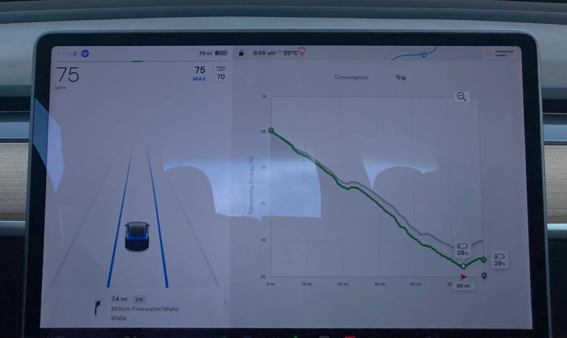
It gives you an idea about any altitude changes along the way. Things like going west out of Denver along I-70. You have to climb to the highest point there before descending to the charging station in Silverthorne. The nav could say you are going to reach Silverthorne with 5% charge, but you wouldn't actually make it because the top of the pass is several thousand feet above Silverthorne. Picture below is of a similar pass in eastern Oregon. That pic is from 2 years ago, so an older version of the graphics.SoC vs Miles? Don't really see the value myself.
It also gives you a nice idea of if you are making the predicted efficiency for the leg. You know early on how you're doing against the plan and if you need to adjust. In this image, the grey line is the original prediction and the green line is the usage until now and the latest prediction. For the new graphics, you see the same info, but also get the yellow/green colors shown above if you are doing worse/better than the plan.
Trip Energy Graph:
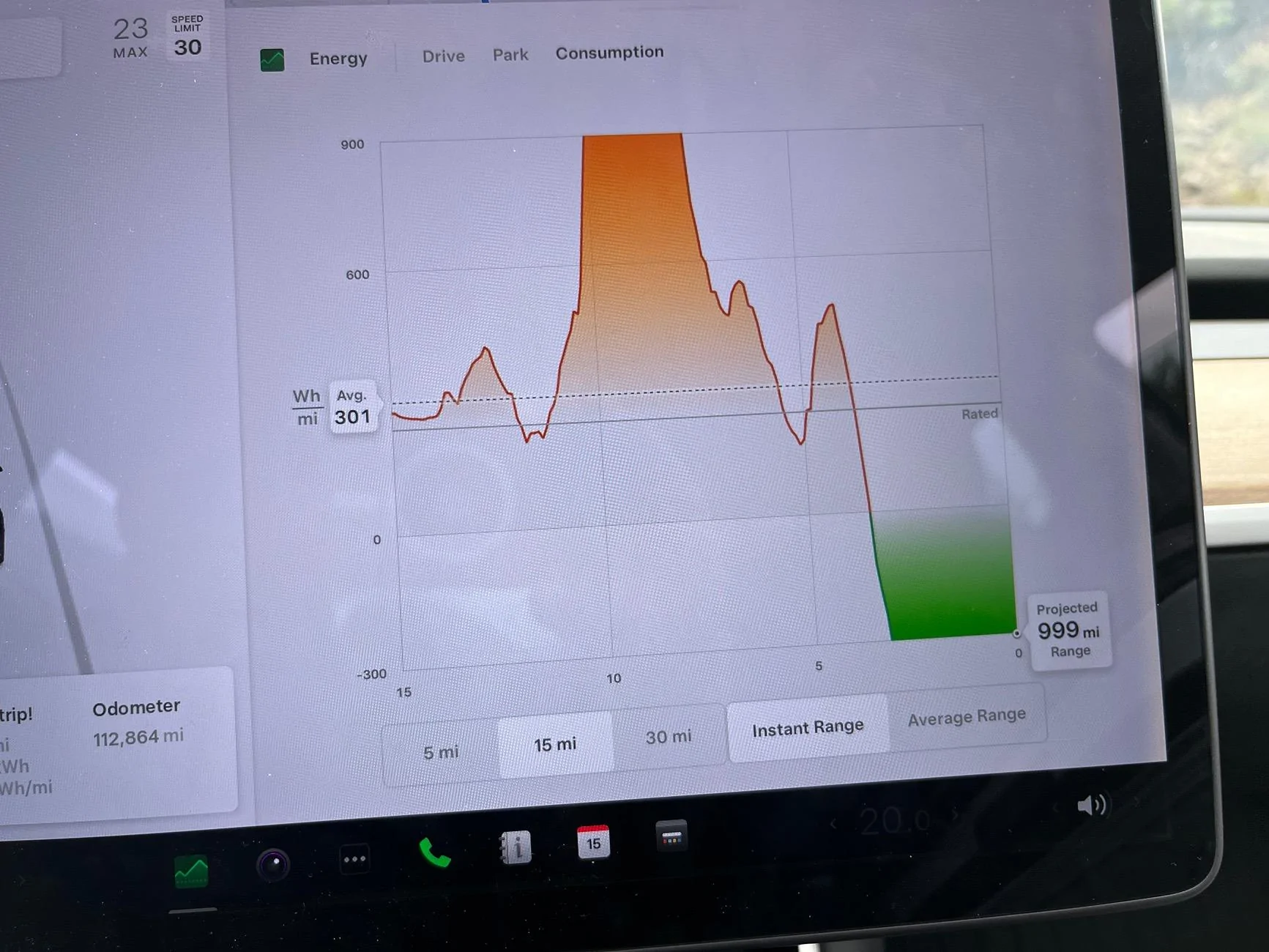
I also like the graph that Tesla does for efficiency. They graph it as Wh/mile over the last 5/15/30 miles. This graph is much more reactive than the graph that Rivian gives, giving some actual insight into the real-time energy usage of the vehicle. The graph below is from taking the "Bachelor Loop" near Creede, CO as I climbed and descended a couple thousand feet in a relatively short distance.
Consumption Energy Graph:
Sponsored